
B2B UX Can Borrow from B2C, If You Know What To Take
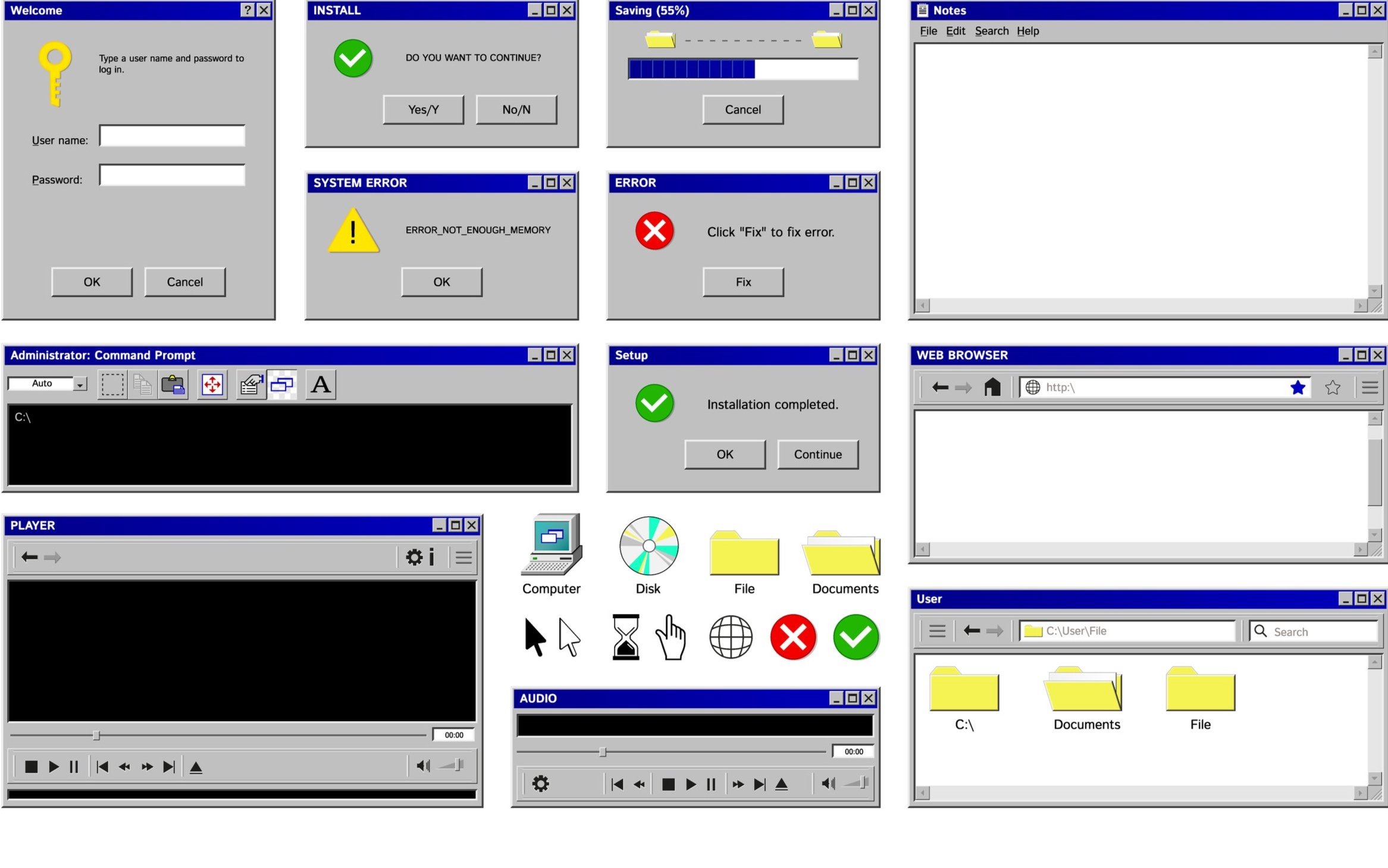
You're in a good spot: your software is delivering cutting edge functionality. There’s just one problem: your product looks like it was built in the 90s.
STAY IN THE LOOP
And worse than that, it’s clunky to use! But you’re not alone, it’s a problem for many B2B software producers. As a solution, we’re seeing more and more B2B software borrowing from B2C design patterns, but tread lightly - it’s not as straightforward as it may seem.
B2C and B2B products have different goals. B2C experiences prioritize the benefit of the platform, they’re built to keep users engaged, scrolling, and purchasing - a well informed user is one that is more difficult to manipulate. B2B experiences prioritize supporting users in making informed decisions and getting stuff done as efficiently as possible, all for the benefit of the user.
Remind you of anything?
B2C is the typical proving ground for UI and interaction trends - there’s higher volume and the stakes tend to be lower. So after they prove their usefulness, they flow into B2B. And that, alone, isn’t a bad thing. There are plenty of good practices B2B products can borrow from B2C.
The key is to borrow thoughtfully, not blindly.
So yes, take inspiration from B2C, but be discerning about what and how. Here are two recent examples of how we’ve seen this go poorly and some advice on how to do it better:
Over-Prioritizing Mobile at the Expense of Desktop Users
Why it fails: Many B2B tools are used on large monitors with multiple tabs open. A mobile-first approach that sacrifices options for simplified views can cripple power user workflows. But remember, not all B2B software is desktop-first - technicians in the field, daytraders on mobile, and bankers on legacy browsers all have different needs.
A better approach: B2C has perfected mobile simplicity and responsiveness. Take what you can by ensuring your mobile experience is clear, fast, and easy to use, but never at the expense of a robust desktop experience if that’s where your users spend most of their time.
AI-Driven UX That Over-Automates Decision-Making
Why it fails: Consumer apps use AI to drive engagement (think, Netflix recommendations), but B2B users need transparency and control. Over-automation can mislead users and result in mistakes with real-world consequences.
A better approach: AI can provide rich benefits and efficiencies in B2B products, but the goal should be assistance, not automation. Borrow B2C’s knack for smart recommendations, but make sure to give users clear controls and visibility into AI-driven decisions.
The Bottom Line: Research First, Trends Second
Great B2B design comes down to knowing your users. Before borrowing from B2C trends, ask:
Who is using this product? In what environment? On what device? With what goals?
The best design choices don’t come from chasing trends, but from deeply understanding the people who rely on your software every day.
Stealing from B2C can be a game-changer and let’s be honest, nobody wants to return to the interaction models of early B2B software! The key is to apply B2C design patterns in the service of your users’ goals, not just because it looks good. Design for clarity and transparency – your users will thank you.
LET’S DISCUSS YOUR NEXT PROJECT
We look forward to hearing from you.